Once UI 2.0 is an open-source React design system with reusable components, layout primitives, and design tokens. Its documentation and task guides help developers and coding agents build consistent interfaces.
A collection of accessible, customizable PDF components for React, distributed through shadcn. It provides ready-made document blocks and templates built on Takumi and Forme.
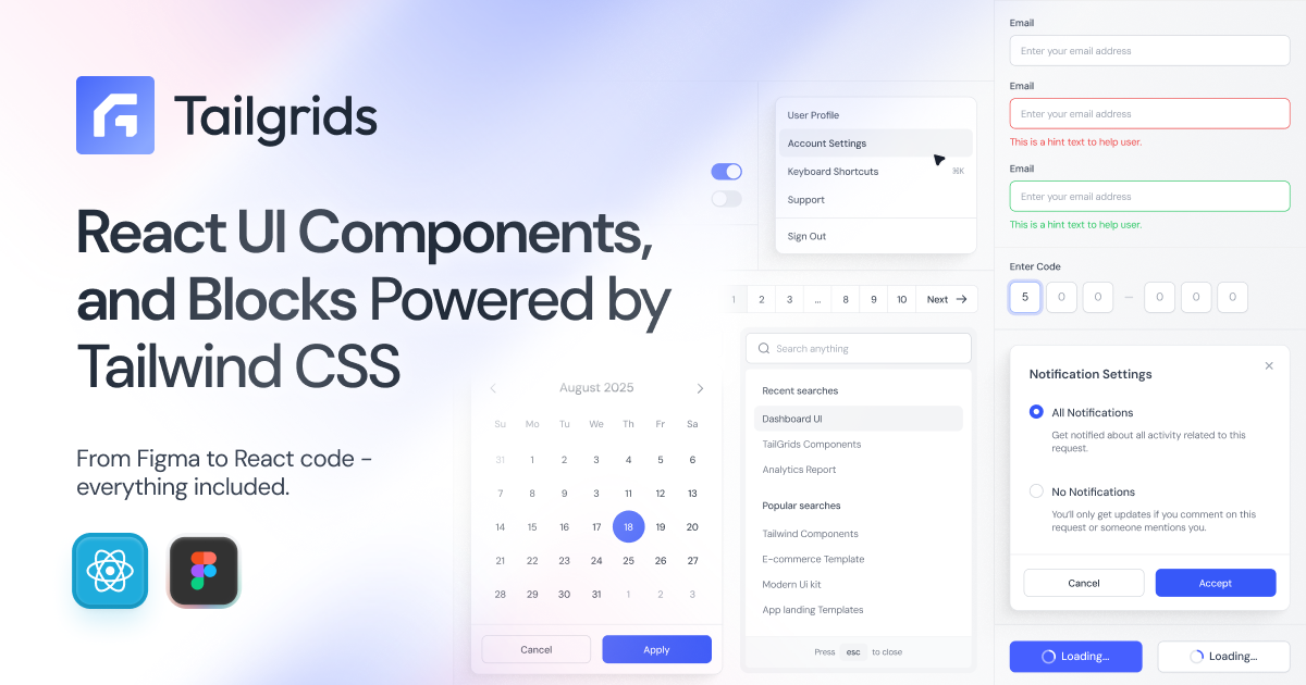
TailGrids is an open-source React UI library built with Tailwind CSS, offering hundreds of production-ready components, blocks, and templates plus a matching Figma design system.
A lightweight, framework-agnostic component library built with Tailwind CSS that brings shadcn/ui's design system to any web stack without requiring React.

A free, open-source registry of composable, accessible React components that extends shadcn/ui with advanced blocks like Kanban boards, Gantt charts, and code editors.

Free, open-source mobile UI component library built with Tailwind CSS, offering pixel-perfect iOS and Material Design components for React, Vue, and Svelte.
A modern, production-ready React component library built with Tailwind CSS v4 and React Aria, offering accessible components with no provider wrapper required.
Open-source, shadcn-style terminal UI component library for React, built on Ink and OpenTUI with zero-config, copy-paste components.
A satirical React component library that turns common AI-startup landing page tropes, glowing CTAs, gradient text, and logo marquees, into ready-made, reusable components.

A web-standards component library for htmx v4 and Tailwind v4, offering accessible copy-paste components across Hono JSX, Jinja2, Go templates, Phoenix, and raw HTML flavors.
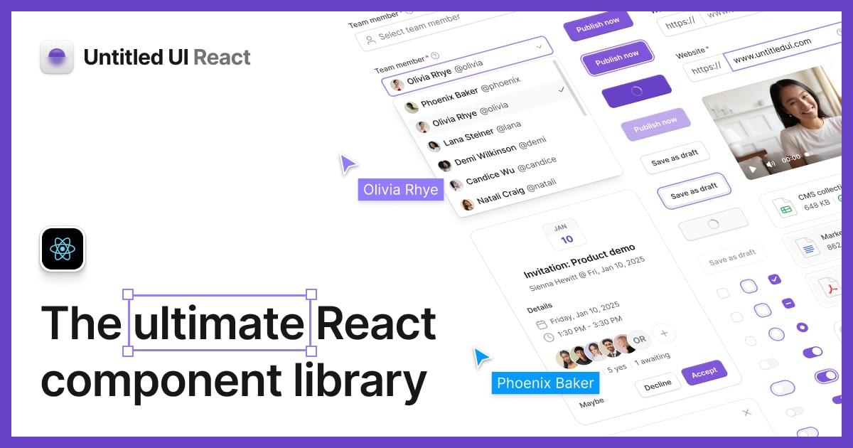
The world's largest open-source React component library, built with Tailwind CSS and React Aria. Copy, paste, and own the code.
A community-driven marketplace of hand-crafted shadcn/ui-based React and Tailwind components, blocks, and hooks, installable with a single shadcn CLI command. Think npm for design engineers, with live demos for every component.
Meta's open-source design system with 150+ accessible components, brand-level theming, and a CLI, built so human developers and AI coding agents can build with the same tooling.
Unstyled, accessible React UI components from the creators of Radix UI, Floating UI, and Material UI, built for teams who want full control over styling their own design system.
A community-powered library of free, copy-paste UI elements built with CSS and Tailwind. Browse hundreds of buttons, cards, loaders, checkboxes, and more — all open source and ready to drop into any project.
Completely unstyled, fully accessible UI components by Tailwind Labs, designed to integrate with Tailwind CSS. Includes modals, dropdowns, listboxes, and more.
A collection of beautiful, animated UI components built with Tailwind CSS and Framer Motion. Simply copy and paste into your project.
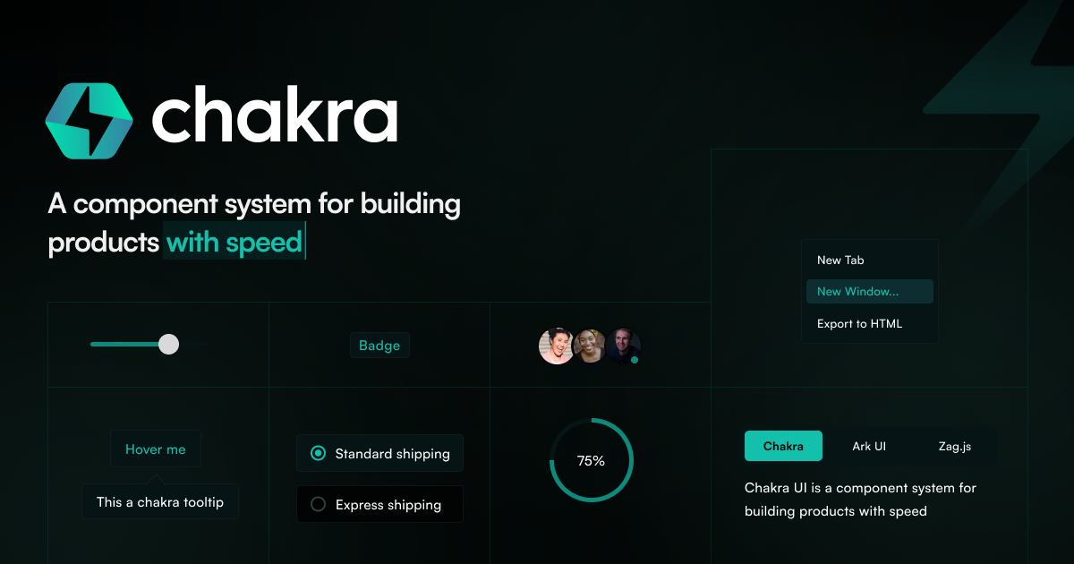
A simple, modular, and accessible React component library that gives developers the building blocks to create inclusive applications. Chakra UI follows WAI-ARIA standards and supports light and dark modes out of the box.
A headless component library built by the Chakra UI team, providing accessible and composable UI primitives for React, Vue, and Solid.
Open-source library of 150+ animated UI components and effects for React, built with Tailwind CSS and Motion. Copy-paste friendly with no external dependencies.